Redesigning The USer Experience for tracking activities & health of pets for 50K+ users.
DURATION
2 months
PLATFORM
iOS & Android App
Sole UX/UI Designer
ROLE
CLIENT
DogLog, LLC
Express-Lane Overview
Through usability testing and data analysis, I identified pain points and areas for improvement within the DogLog app interface. I aimed to make it more modern, user-friendly, and engaging for pet owners everywhere. The subsequent redesign resulted in a remarkable 30% increase in user engagement and a 25% boost in app retention rates. These metrics reflected the impact of my efforts in addressing user frustrations and enhancing overall satisfaction.
Before Diving In
The DogLog app is a mobile app designed to track your dog's activities and health while fostering better coordination between you, your spouse, or your pet care provider. It offers easy customization of events, analyzes data and stats for trends, and sets reminders for more tailored schedules for your pets.

The opportunity
my objective was to enhance the DogLog app's usability and functionality to better serve its audience of pet owners.
As a user myself, I saw an opportunity to elevate the DogLog app to new heights. The app, while functional, had its share of challenges – from complex navigation to inconsistent design elements, and limited features, leading to user frustration and low adoption rates.
Problem #1
Outdated UI
Having an outdated look creates doubt and trust in keeping up with modern trends. This effects the brand outlook and confidence in the interface to respond similarly as current designs.
The use of old backdrops and frame designs suggests old-fashioned. In addition, the usage of CTAs, icons and grid layouts are not easily distinguishable.
For example:

Problem #2
Inconsistent Patterns & Experiences
The lack of consistent patterns can cause unease when completing tasks and events within the app. This can cause a user to be flustered and confused about what to expect when there are too many unknown patterns.
The filtering feature uses radio buttons to indicate multiple selections while it’s been known to select one option over another. Also, the search function doesn’t have similar attributes as a conventional search button.
For example:

Content & Hierarchy Is Unclear
Problem #3
No clear structure for content as it relates to visual hierarchy. This can cause confusion and can come off as unstructured and unorganized.
The headlines, titles, and descriptions all visually look the same and has little distinction. The event number at the top takes precedent, giving more prominence than the rest.
For example:

Problem #4
Unconventional Spacing, Layout, and UI
Non-use of design principles and fundamentals creates an unconventional look that affects composition, hierarchy, and overall theme causing mental strain and efforts to comprehend the app’s goal.
There’s a lot of negative space on the optional comment, while other sections are not as prominent. The placement of “Add a photo” is at the bottom of the screen while the “Finish” is located at the top right corner placing more emphasis on one over the other.
For example:

What I’m Looking To Solve
“
How might we redesign a better and More modern experience for Users to easily view, log, and track their pets’ activities?
How Do I know this is the right thing to solve?
user preferences, Feedback, and key indicators All point to confusion and uncertainty.
During the initial stages of the project, thorough competitor analysis and usability testing revealed several issues that needed attention. These included confusing navigation paths, cumbersome data entry processes, and a lack of intuitive features for managing pet profiles and activities. These findings provided insight for a comprehensive overhaul of the app's interface and functionality to address user frustrations and increase the overall user experience.
Here are some discoveries I came across:
43%
Rated themselves as a novice dog owner.
100%
Had no prior experience with a dog logging and tracking app.
71%
Felt the current UI was visually appealing.
57%
Found the main features easy to locate and access.
43%
Rated the clarity of labels and icons to be “Kind of clear.”
71%
Felt lost and unsure of what steps to take while performing a task.
57%
Would most likely use the app on a daily basis.
What was my strategic approach?
I simplified the Interface and Reformatted the layout across screens Through A modular Design System.
With a new design system that has a modernized interface, it helps create consistency and is user-friendly allowing the user to easily navigate, log, and track their dogs’ activity with ease.
Added New Design Features to increase A Seamless flow and interaction.
Along with creating a style guide, incorporating additional design elements to show progress, set reminders, and content hierarchy help align the user’s flow and experience.

The IMPACT
Gathering insights from the usability testings and user research, the design iterations resulted in a very positive experience.
60%
Rated the redesign a 10/10 in terms of the overall usability.
“It is definitely much more user friendly compared to the first initial interaction with the app.”
100%
Found the new redesign more visually appealing.
“Each labeled section made clear sense in what I would find under that tab. I think more people would enjoy using the app if the prototype was the main one.”
7/7
Felt the design layout is much more intuitive.
“Yes the prototype was more intuitive. Again it was easy to navigate through, didn’t require too much clicking around to figure out where I needed to go to log something or find information about my pet.”
80%
Found the labels and icons to be “Very clear” compared to the original.
“This prototype allows me to self serve more sufficiently and is less time consuming because the layout makes much more sense.”
7/7
Ranked the redesigned app an 8 or higher in terms of how likely they are to use the app on a daily basis.
The Final Look
Looks Clean. Feels Modern.
Before the project, I initially believed that simply polishing and refreshing the UI would suffice for the DogLog app. However, as I delved deeper into the app's user flow, I realized there was more to be done. The new design mockups have addressed the issues of modernity and user-friendliness by introducing a modular design system, scalable components, and restructuring of the content hierarchy and layout.

A Modular Design System
I utilized different aspects of Apple’s Human Interface Guidelines and Google’s Material Design, along with different component plugins to compile DogLog’s UI foundations.
Revitalized Home screen
The main screen after logging in shows a clickable tile for the user to click into their pets’ account. Also, the user can easily add pets to that pack.
View & Track Events: Main Log Page
While the current design does a good job outlining the events/activities, the user now has a cleaner layout, content hierarchy, consolidation of action items, and an overall aesthetically pleasing interface.
Gather Statistics & Pet Information
While the current statistics tab shows a confusing chart with no clear indicators and the pet information uncategorized, the new mockups aimed to make the information easily digestible and readable.
Add Multiple Events With Ease
The Log Events page is straightforward and user-friendly for users who follow a single linear path. However, utilizing a more profound layout and the ability to select multiple events helps alleviate frustration of having to navigate between multiple screens.
Set Your Mind At Peace With ReminderS
Before the redesign, my users indicated the struggles of navigating the Reminder tab and comprehending the output screen once they had set reminders. Through several iterations aimed at enhancing the UI and simplifying the reminder setup process, the new mockups were more intuitive, and user-friendly; aligning them with the conventional reminder setup.
Navigation Restructuring
The Settings tab was disorganized and unstructured, blending universal settings with promotional features, personal account settings, and app overviews that created confusion. To address this issue, I decided to replace the Settings tab with the personal account information and utilized the hamburger menu. This change helped me divide and compartmentalize each section more clearly, resulting in a more universal and organized navigation within the app.

Ready To Experience the REimagined DogLog App?
Key Takeaways
Continue to AdApt
Through this redesign, I primarily focused on revamping the core pages. However, as my user base adapts to the app, I've observed an evolving dynamic in how content is displayed on additional pages and what users expect to see upfront. An ongoing analysis would be crucial to ensure the designs align with these changing user preferences. This may entail adjusting the new designs to new audiences seeking more robust features beyond my initial findings.
Refrain from my own biases
As a user, I am constantly reminding myself that I’m not making changes to the app based on my personal needs, confirmation biases, or experiences. I heavily lean on the usability tests and the research done from auditing other competitor apps to help guide me along the way. This helps confirm my design iterations that are not just from a UI perspective but also from a user perspective as well.
Next Steps
Moving towards Development
By understanding the new designs and experiences that were analyzed, will be instrumental in modernizing the DogLog app and ultimately the business outcome. With that in mind, presenting this project and the results of my findings to the stakeholders can accommodate the next set of iterations on the current app. This new course could potentially help attract new users and introduce new features to boost revenue growth and relevance in the industry.
More To Explore
-
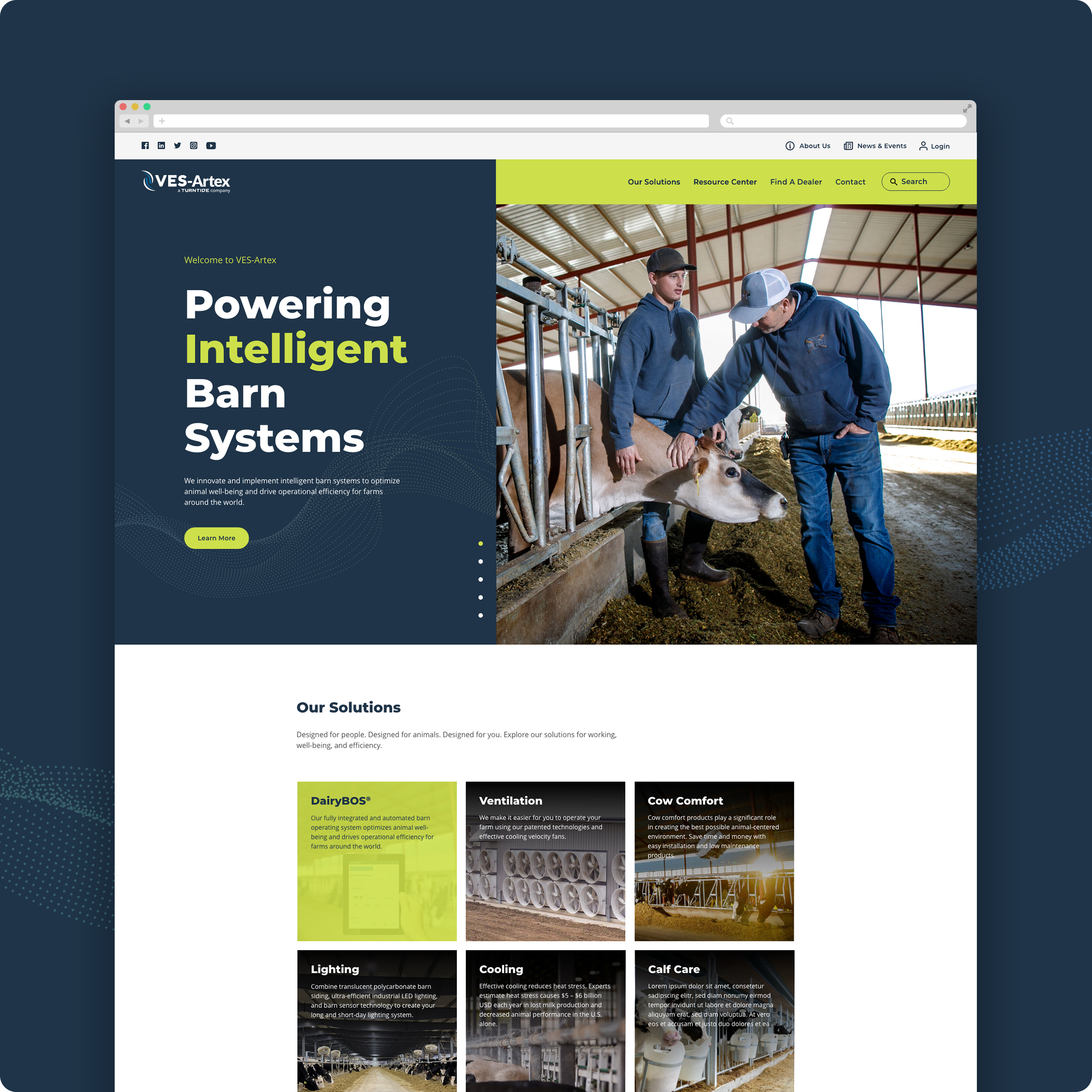
![VES-Artex-Thumbnail-Image]()
VES-Artex
Designing a fresh and modern website for the agricultural tech industry.
-
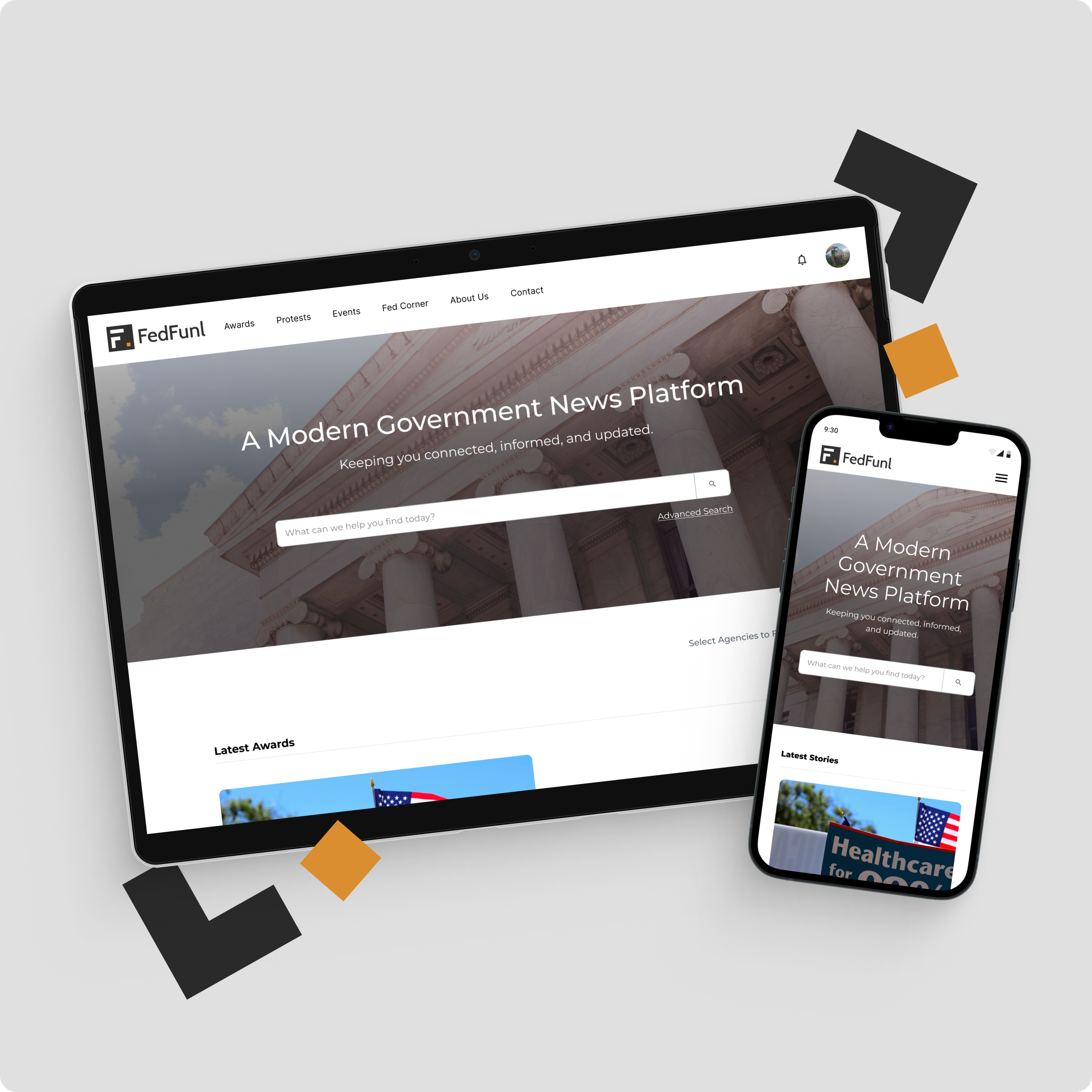
![FedFunl Website]()
FedFunl
A dynamic collection of news articles tailored for the government contracting audience.