VES-ArTEX Website Redesign
VES-Artex provides a technology solutions for environmental systems in agricultural facilities. They focus on the well-being of animals as the foundation for their agricultural success while strengthening the capabilities to impact agricultural performance through their technologies.

PROJECT Overview
About
VES-Artex’s website redesign involves reconstructing and reimagining their overall look and feel of the website to be modern, fresh and easy to use. The website not only focuses on the design aesthetics but also the customers’ experience when navigating through their website.
Project Duration
1.5 Months
Client
VES-Artex
Role
UX/UI Designer, Web Designer, Visual Designer, Interactive Designer
Goal
There were multiple objectives that were needed for this project and some involved their website to look and feel more modern, easy to navigate, secure, scalable, fast, reliable and responsive. In addition, they were looking to utilize WordPress as their main CMS.
My Role
I led the redesign of their core web pages, restructuring of their navigation architecture in the main header and footer, evaluating their content hierarchy, brand remodeling and building a consistent UI components library.
The Solution
As I delved into their brand and their existing web pages, I decided to incorporate a more open space concept where each section allowed the content to breathe. I carefully restructured the information to make it easier to digest once the layout structure was in place. To add visual interest and engagement, I incorporated colors, textures, icons, and imagery. Considering that the website was going to be developed in WordPress, I understood the importance of keeping the UI elements consistent to preserve the brand's aesthetic while minimizing the need for significant design adjustments.

The Architecture
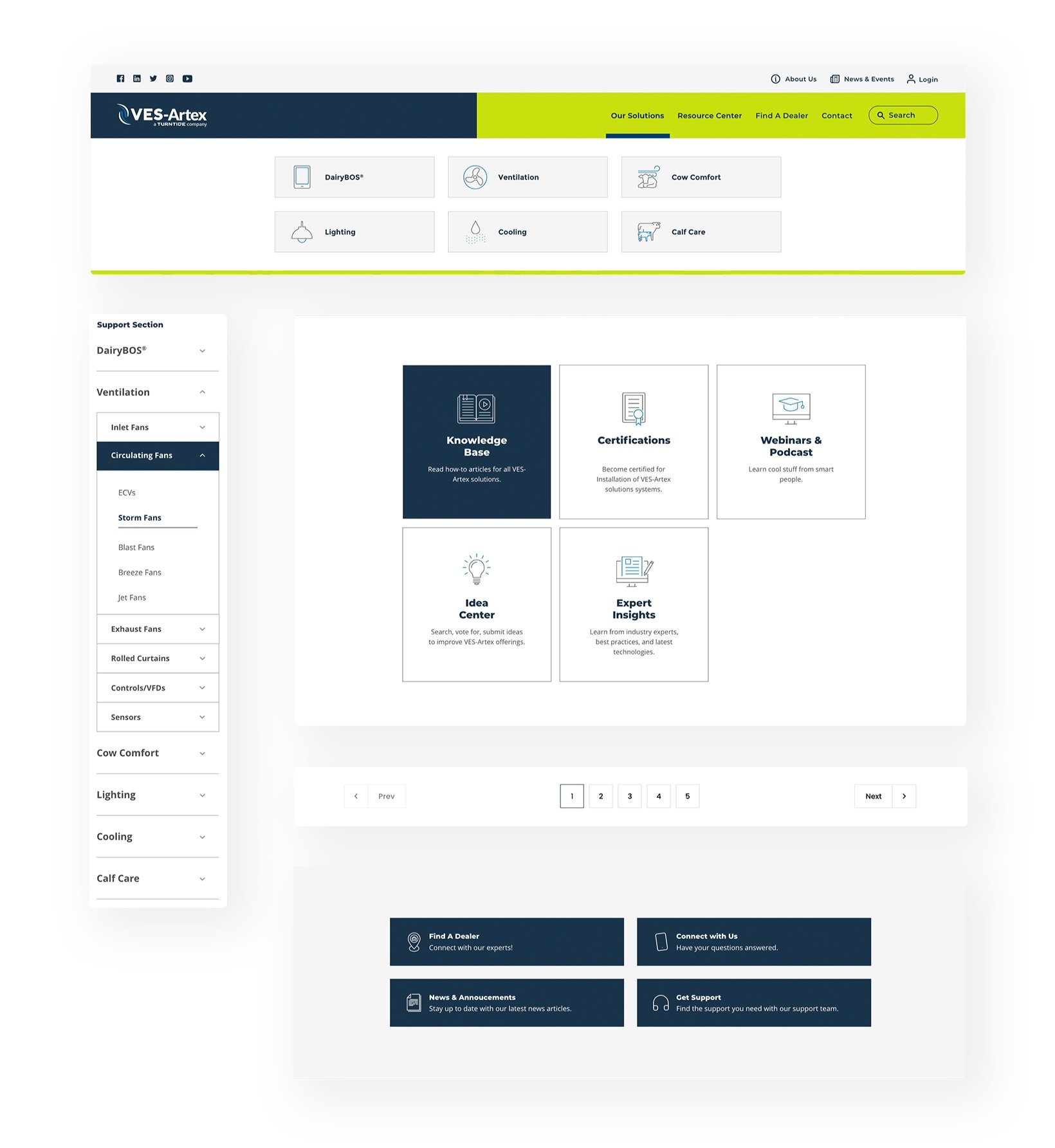
I started out by crafting a site map that outlined all the essential pages and thoughtfully organized the subpages within their respective categories. When it came to designing VES-Artex's "Our Solutions" and "Resource Center" pages, I was faced with some unique challenges. To ensure a smooth customer journey, I strategically positioned a tertiary navigation to assist users as they explored these sections.

Mapping Out The Layout
Given the limited time available for me to conduct a comprehensive research analysis of the customer journey, my next step was to gain a clear understanding of how the pages should naturally flow, using the content provided by the client as a guide. Keeping our goals front and center, I designed the wireframes to visually map out the placement of each piece of content, prioritizing them based on their importance and choosing layouts that would best complement the content's visual presentation.
High-Fidelity Wireframes


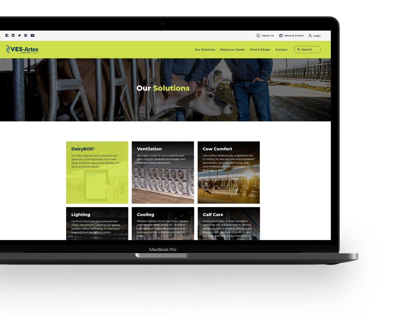
Main Page
VisualizIng the Brand and SETTING The TONE
The main page is all about showcasing what VES-Artex has to offer, with a special emphasis on their products and services. I wanted to captivate the audience with engaging visuals and bite-sized pieces of information that gave a glimpse of their solutions. Additionally, a knowledge hub section was created on this page, serving as a valuable resource for our customers to explore more about their products. This dual focus makes it a priority to engage their audience while providing them with a wealth of information.
Desktop

Tablet

Mobile

Component Blocks
UI ELEMEnts for usability
I crafted these component blocks with a specific focus on enhancing the user experience for each page. Take, for instance, the use of the nested accordion feature on both the Products and Knowledge Base pages. This component allows users to efficiently filter down to individual products, ensuring that everything is neatly categorized under the correct Solutions bucket as customers navigate through the content. The goal here is to make sure every product finds its place in the most intuitive and user-friendly manner possible.

Sub Pages & Mobile Designs
Constructing the WebPages
Once the main page and core components were set up, the next step was to work on the subpages, all while keeping the design theme intact. Not only were the existing design components a time saver, it also ensured a consistent and cohesive look and feel throughout the website. This approach also allowed me to use the core pages as templates in WordPress, making it easy to build out the rest of the pages while maintaining our design's overall tone and style.


PrototypE
Connecting IT All Together
After the page designs were done, I went ahead and crafted two prototypes – one tailored for desktop and the other for mobile. It was essential for me to ensure that these prototypes not only connected the pages seamlessly but also brought a touch of interactivity to the table. Therefore, I added subtle yet engaging elements like hovers, drop-downs, and sliders to the mockups. These prototypes were invaluable for both internal and external testing, allowing them to really get a feel for how the designs would come to life across different devices.


